The 11 Most Effective Strategies To Capture More Leads From Your Website In The Next 60 Days … Without Spending More On Traffic
We’re just going to jump right in, so you can get started snagging more leads without spending more money, ASAP.
1. Clear Connecting Copy
You’ve got just a few seconds to grab a prospect’s attention when they land on your website and these are critical because if you lose them at this point it is an uphill
struggle to get them back again.
Clarity and connection are key here.
Use words that are super clear, simple and easily understandable by anyone even if they were 7 years old.
Connection then once you have done that, litter your copy with industry-specific words that evoke emotions.
The objective here is to get the right prospect to self identify, raise their hand and take the next step because they feel like you’re in their heads, reading their mind, and you’re the right type of person for them.
2. Lead Magnet
The smartest marketers know that not all leads are created equal.
Some people are ready to buy now and others well not yet because they need a bit
more education, a bit more information, a bit more getting to know you.
Introducing… the lead magnet.
It enables you to do 2 things.
First, you give great value. This guide you are reading right now is a lead magnet it
doesn’t have to be too long, but has to be valuable to your ideal prospect.
Secondly, when you give this away, you ask for at least their name and email address, so you can follow up in a leveraged manner via email marketing (more about this later).
Now you have converted a prospect from being a prospect on media you do not
own (social media, google, etc) to a format that you do own (email list).
Not that any of these platforms are going to disappear tomorrow, but if they did
you’d still have the email list and also emailing people is still the most cost-effective marketing method around.
3. Mobile Optimised Layout
Standard themes may adapt your website to make it such that clients can navigate your mobile site, but this doesn’t guarantee that your website will have a mobile optimized layout that turns traffic into leads and sales.
80-90% of people in countries that have fast mobile internet speeds (4G/5G) first browse websites on their mobile, then they browse on their desktop/laptop.
The worldwide average is 56% but after serving many clients every time I look at the stats 80-90% of their traffic comes from mobile.
This is important because if your website is not designed to serve the mobile market well, then you’re losing a massive chunk of your potential clients.

4. Mobile & Desktop Optimized Speed
You have seconds to grab people’s attention, it’s a bit like a Formula 1 race 0.5 seconds can make all the difference.
If your website is slow, clunky and built inefficiently, you may be losing a lot of prospects, unfortunately in this day and age, most people are not willing to wait more than 3 seconds for a website to load. After 3 seconds, every second longer, you lose a considerable chunk of traffic as people get distracted easily.
First impressions count and unless you’ve developed a deep relationship before they hit your website, chances are you’ll lose them, potentially forever.
You can check out your website speed here: https://pagespeed.web.dev/
You want to be hitting 90/100 as an ideal target for each page on your website.
5. The Power of One
People are notoriously bad at getting distracted, including your prospects. In this day and age, this is an increasing challenge.
Hence, each page needs to serve one purpose without distractions. I say purpose here because there may be different calls to action on the page and there may be a purpose for this, but you have to be clear on the purpose of each page first before you make such decisions.
Once you know the purpose, you can design the page to serve that purpose, which increases conversions.
You can remove the things you may have one day thought was a great idea, but the prospect has no interest in.
6. Blog Side, Middle & Bottom Widgets
This is a big win if you have a lot of traffic.
Widgets on the side, middle and footer of your website that lead people to your lead magnet, book a call or something that gets them to take an action.
These places are prime digital real estate given that if they are reading a blog post they are getting huge value and are primed to then want to take some action.
Having it in multiple places means people can not miss it or forget, they take action when they are ready to do so at the start, middle or end of the blog post/page.
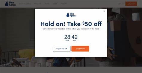
7. Exit-Intent Popup

Some people when they go to leave a website may not have seen the action you’d like them to take that would be valuable to them, they may be on the part of the page that doesn’t show them this action, or they may have just missed it.
When they go to exit the page, one additional popup appears to give them another option.
If you got an extra 5% or 10% of people opt-in to your lead magnet, given that not all leads are created equal, and thus you don’t know where your next best lead is going to come from, this could be a game-changer for you.
The key here is to do it elegantly, with style, with finesse, so it doesn’t feel salesy and pushy.
8. Analytics
- Where do your prospects come from?
- What do they browse on?
- How long do they stay on your site?
- What pages are most visited?
Analytics allows you to know this information, and this information leads to a clearer understanding of what’s working and what is not.
When you know this, you can focus 80% of your efforts on the 20% of the pages and parts of your website that gets the most leads and make them parts better.
Track, track, track.
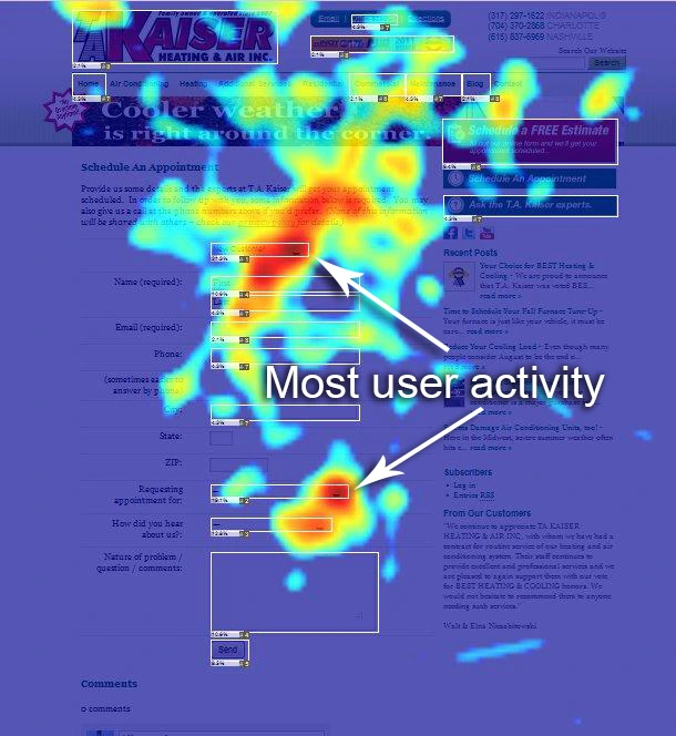
9. Heat Mapping

This goes hand in hand with analytics, but this is super cool, it will show you exactly where people scroll, click and actually do on each page of your website.
This has another layer of importance because it gives you the details of what on the page itself is working and what you might need to change.
Imagine knowing that someone clicked on an image that did nothing… a game changer now you can make it do something and retain the engagement with your prospects.
It is basically knowing the most likely moves people will make on your website, so future prospects are served better and are more likely to take the next step.
10. Help Desk
Deep connection and personalization have never been more important than ever before, and this can be automated.
In this world of automation, there are bots doing all sorts of things for people, I am all for automation when it feels personal when it creates a better experience without lying.
Having a help desk chat option on your website even if you’re manning it all the time can enhance the experience. Often when people have questions, they don’t know where to go on your site to ask.
This sounds crazy but in reality, most people don’t go to the ‘Contact Us’ page and type in a request, most will just go off the page. And good luck with getting them to open their emails and email you.
Make it easy for them, make them feel as if you are easily accessible or one of your team are easily accessible, it brings connection, comfort and certainty.
A popup video at the start of the help desk will make a world of difference. It lets your customers see your face, hear a short message and connect.
11. Welcome & Followup Email Sequence
The best marketers in the world (and now you) know that a maximum of 3% of people are looking to buy right now.
And they also know that out of all the people that come across you, typically long term 30% of them will buy from you at some point.
This is where your welcome sequence and follow-up sequence comes in to first build the relationship (welcome sequence) where they can get to know you better, sample your best content, and hear what you do in your words.
Then continue to follow up after to stay top of your prospects’ minds so that when they are ready to take action they know you are there, they can reach out and you can have the sales conversation.
This is so important, imagine making 27% more sales from the exact same people on your list.


