Everyone wants an email that looks great and converts like crazy. It’s been proven that email marketing is an effective way to reach out to your customers. In fact, the return on investment of your email marketing is one of the highest in terms of marketing.
But do you know what it takes to create a high converting email that invites floods of opens, click-throughs and conversions?
Imagine this: You’re creating an email marketing campaign. You sit down, roll up your sleeves and start working on your email. You write the copy, add images, your URL and the CTA. You hit “Send”.
A few days later, you excitedly check the results of the campaign in your analytics to see an increase in traffic to your highlighted products. Problem was, no conversions. What happened?
You probably did everything right, but your email might need some changes to drive conversions. If your subject line is off, your copy is out of sync or any other part of your email is not right, your conversions can plummet.
In this guide, we’re going to break down the basic elements of a high converting email. You’ll discover how to create convincing subject lines, how to get personal without being too personal, and how your signature and P.S. can convert readers.
We will also be sharing some examples and subject lines to inspire your own campaign.
Let’s begin.
The Subject Line
Many people often feel anxious when they try to create the subject line for their emails. Others don’t give it much thought, quickly slapping something mundane in the box. But you’re losing out on opens when you do this.
Subject lines impact your open rates.
The subject line is the most important part of your email, since it’s what the subscriber first sees. It can grab their attention, making them want to immediately open and read. Or it can be the reason your emails end up in the trash.
Take your time creating a subject line.
It’s by far the most challenging part.
It’s difficult to condense all you want to say from your body copy into the short space allowed.
Use one of these formulas if you need help crafting your subject line:
- Ask a question. This formula is probably the easiest. And these get people to think about how the topic relates to them. Questions make them feel like you care about them. Which makes them more emotionally attached to your brand. Example: Apple asks, “Got plans for tonight?”
- Use the “how-to” formula to teach people how to do something. People want to know how to solve their problems. They are already searching the internet for the answers. You cut down their search time by offering the solutions in your email as how-to content. You’re also positioning yourself as the expert on the topic, increasing your credibility. Example: “How to increase your opt ins overnight”
- Use scarcity to create a sense of urgency. This type of formula encourages readers to act quickly, so they don’t miss out. The key is that the scarcity and /or the urgency must be real. Don’t mislead your reader by falsely claiming you only have xx slots left or hours remaining if you have more open spaces. Example: “Act quickly while supplies last— the 50% discount ends tonight”
- Make an announcement of something in your subject line. If you have something new to offer your audience, send an email with the exciting announcement. This type of subject line displays a sense of timeliness, encouraging recipients to act immediately to be included in the latest. However, don’t use the word “newsletter in your announcement. Example: Birthday VIP offers are live!”
- Surprise your readers. Give them something unexpected. Surprise them with a free gift or free content. Use the word “free sparingly and honestly. Giving something away makes your audience feel a sense of reciprocity for the gift and likely to want to return the favor, possibly by purchasing one of your paid services. Example: “My gift especially for you.”
- Personalize your subject line message. Make it seem like you’re writing a personal email specifically to each individual. Include their first name in the subject line. Include words like “your” if it works better than their name. Example: “Your visit to Bali.”
- Create curiosity with your subject line. Curiosity makes them naturally want to interact with otherwise static content. It provokes your audience to engage with your brand. Example: “Do you remember your first time…?”
- Include a number or a statistic in your subject line. Sharing facts backed by numbers increases your credibility and build trust with your audience as a reliable resource. Example: Money saved: Trim users found $100 savings on similar utilities.”
- Use Listicles or numbered lists. Using numbered lists is an easy way for readers to digest your content. Use a quantified number for more open rates. Instead of “Reasons your social media isn’t getting seen” try “23 Reasons your social media isn’t getting seen in 2023.”
- Try to keep it short and to the point. With our attention spans shorter than ever, using brevity captures attention. Use three to five words to create a succinct subject line. It’s quickly scannable by your readers. And don’t yell. Capitalize the first word only. Example: “We miss you.”
Use these formulas to create subject lines that will increase your open rates.
Don’t go overboard and try to use them all.
Find the ones that work with your readers, and always be testing.

Subject Line Starters
Still stumped on creating a subject line that grabs attention. Here are six subject line starters to get your creativity flowing.
- “Don’t open this email”
- “How to find the best ______________ (deal, product, copywriter) on the web.”
- “Are you making these _____________ (fill in with number and/or topic) mistakes?”
- “Flash Sale Alert: ________________ (%, discount,) off”
- “Get Priority Access”
- ____________ (year, subject, person) forecast for ____________ (year, subject, person).
Still stumped on a good headline. You can use one of the headline generators online to come up with a winning subject line.
They include:
Portent’s Idea Generator – http://www.portents.com/tools/title-maker
Hubspot’s Blog Topic Generator – https://www.hubspot.com/blog-topic-generator
Tweak Your Biz Title Generator – https://tweakyourbiz.com/title-generator
Email Body
The body is the main area of the email. It conveys your message.
The first line is called the preheader or the hook, it’s what shows up next to the preview of your email.
It needs to draw the reader in, so they are compelled to open your email and read more.
It can be something unexpected that gets your reader to thinking but curious to read more.
Once they open your email, they’ll scan the content to see if they are interested in reading more. This is when your content and formatting structure needs to be set up right.
It should have an easily scannable structure with headings, short paragraphs with concise copy and bold or italics to highlight important elements.
And use bulleted lists to simplify more complex ideas.
The Body of the text is the meat of the email.
This is where you engage your reader.
Get creative here.
Even though the style is different for retailers, non-profits and service providers, the basic general guidelines work in every situation.
Follow these tips to create your email body:
- Align your email content with your subject line and your landing page copy. It needs to have exactly what your header promised.
- The layout should be pleasing and easy to read. Use headings and subheadings. You can also use different colors and font styles to make certain things stand out.
- Use white space to create a visual balance and direct flow to your CTA.
- The Inverted pyramid model is the most common. It has an attention-grabbing headline with the focus and supporting information, and then the CTA.
- The copy should relevant to the subject. Each word needs to support and be significant to what you are focusing on.
- The tone of the copy should be relatable. Use simple sentence structures with everyday language with easy to understand language.
- Write the copy clearly and conversationally, as if you’re talking to a friend. Use language that is helpful to your reader, and descriptive and actionable words.
- Create hyperlinks to what’s relevant and brings the reader back to your landing page or website.
- It’s fine to include some images that are relevant and add value to the message. Just don’t overwhelm with too many that will distract from the CTA.
- Format the images so they aren’t distorted or blurry.
The body of emails that convert have been optimized for conversions.
Email copy should be about your subscribers.
It should be about their problems, their feelings, lifestyles and of course, the solutions. There are different types of content you can use, that we discussed in the first guide.
The next thing is to include a call to action.
Call to Action
The call the action or the CTA is one of the most important sections of your email. It’s what gets subscribers to take the action you want them to take. People need to be told explicitly what you want them to do.
For example, if you’re sending an email that features your latest product, you need a button that tells your reader to buy it. Or if you want your readers to click on a link to your latest article, you need to tell them to.
In every email you send, you need a relevant CTA. It should focus on the action you want them to take. Use action-oriented text related to the action you desire them to take.
Use one of these samples.
To encourage a purchase use:
- Shop now
- Shop our bestsellers
- Act now
- Shop our spring collection
- Buy now
- Claim your coupon
- Get 30% off now
- Free gift with purchase
- Shop Santa’s favorites
- Our gift: 10% off
For Content clicks:
- Learn more
- Read more
- Download now
- Download the eBook
- Read the full story
- Keep reading
- Watch now
- See the amazing video
- Hear his story
For events:
- Register now
- Reserve your spot
- Book your ticket
- I’m coming
- Save me a spot
- Count me in
- Register for his webinar
Services:
- Book your appointment
- Start your free trial
- Upgrade now
- Start today
- Find out how
- Start now. Get results
Feedback and connections:
- Complete our quick survey
- Take a survey
- Leave a review
- Follow us
- Let us know how we did
- Like us on Facebook
Make your CTA legible. Keep the text short. Keep the number to a small amount, two is best. Place one above the fold and the other one near the bottom.
The design of your CTA can be a button or a different color of text. It needs to be the appropriate size, meaning it can’t fit across the page. Use white space near the call to action to draw the reader’s eye to it.
The copy should be relatable and short. Keep it to the point. Use “I” or “me” whenever possible. And always test your CTA placement, color and copy. Test one thing at a time to see if your changes make any difference.

Signature
The signature is your chance to sell yourself. The average email signature has your name, maybe your title, some way to contact you and possibly your logo.
Keep it simple. It doesn’t necessarily have to be elaborate.
For example:
Jocelyn Jones
Marketing Director, Acme Inc.
Phone: 555-555-5000
This is a simple signature that works for many types of emails. But if you want it to sell for you, it needs to be optimized better. And it’s not doing anything to interest the reader. It’s not building your credibility and authority, either.
And it’s definitely not showcasing anything relevant to your reader.
You want the signature to be a place where you can continue your sales conversation.
Here is where you can make it interesting so that when the reader sees it, they immediately think it looks interesting.
- Add a photo to your signature. You can do this with an email signature generator or the right tech know how. A photo gives your signature more impact, makes it memorable and shows personality. And images draw attention and add interest visually.
- Use color to add visual interest and make your name stand out. Different colors evoke specific emotions, so be sure to use a color that is relevant to your company. Be cautious using color, though. Using more than 1 or 2 colors can make your signature look busy and cluttered, with the colors often clashing for attention.
- Include links to your social media channels using icons that represent each site’s logo instead of using long hyperlinked URLs.
- Create a balanced design between the content, type and imagery. Make use of dividers and white space to separate different elements and direct the reader’s eye. Use bold or capped type to attract the eye to important information but use it sparingly.
Test different ways to sell through your signature in your emails.
- Showcase your press features. Boost your credibility and sell passively by including a link to your press articles in relevant publications. Present ones that highlight your company’s accomplishments. If you don’t have any article features yet, then publish your own recent success and news in your company blog and mention those.
- List links to your recent webinar recordings. Your readers will be curious to learn more about you, your products, or interviews you do.
- Link to positive and relevant case studies you’ve done about your product or service. Case studies add a huge amount of credibility for you. Potential customers get the opportunity to hear the benefits and how your product is used from those actually using them.
At the very least, your signature should identify who you are and what you do, your company and how to contact you.
But by including links and other information about what’s going on in your business, you create another form of a call to action for the reader.
P.S. Power
The P.S. is the postscript. It’s the last little additional thought you add at the end of your letter or email. It’s a way to reiterate the call to action, provide bonus information or offer, or share a testimonial.
The P.S. is a way you can get a specific point in your email noticed. People tend to remember what’s at the beginning and end of text in your emails, so including a P.S. is a great way to quickly reiterate what you want them to do.
“The P.S. is the most charming part of a letter. It’s the wink you give as you walk away.”
—Shaun Usher, author of Letters of Note, for The Wall Street Journal
- Use the P.S. to create a sense of urgency. It could be a deadline approaching, a limited number, or something else that gets readers to take action.
- Use the P.S. to provide another CTA. Invite readers to take action by linking to your landing page, a video sales page, your webinar registration page or some other type of action.
- Use the P. S. to add another thought to your email. This can be an extra thought that doesn’t quite fit into your main message, or maybe a funny thought that makes your email stand out from other messages.
- The P.S. can be helpful in making connections. Invite readers to connect by adding links to your social media channels or subscribe to your side-content such as podcasts, videos, blog, etc.
- Promote bonuses or share more value in your P.S. Share discounts, previews, extra tips, testimonials from other customers, bonuses or anything else that is of value to the reader.
The P.S. is the perfect place to add extra value, reiterate your message, and the last chance to ask for the reader to take a specific action.
Sample Emails
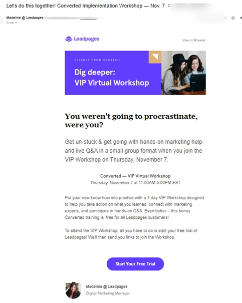
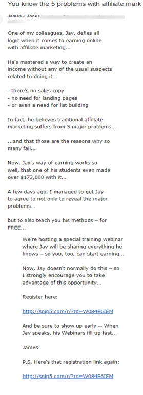
Need some inspiration? Here are two, very different examples of good emails to help you craft your own high converting email.

And this one…

Do This Next
Now that you know what elements you need to set up a high converting email, it’s time to create your own.
Use the ideas and sample emails in this guide to help you craft emails that sell your product or services, build relationships with your readers, and excitedly draw them into your company.
Let’s revisit our imaginary email marketing campaign from the beginning.
Suppose you create an email message using the techniques you’ve learned in this guide.
Imagine this: You’re creating an email marketing campaign. You sit down, roll up your sleeves and start working on your email.
Except this time, you create an attention-grabbing subject line that pulls your reader in. You add a preheader that entices the reader to open the email and continue reading.
You write relatable, relevant copy that inspires and entertains. You add images, laying out the copy in a way that flows.
You add a call to action near the beginning and again at the end of the email.
You put in your signature that includes your URL, your image and links to your social media channels.
You add an P.S. with a discount code to your product. You hit “Send”.
A few days later, you excitedly check the results of the campaign in your analytics to see an increase in traffic to your highlighted products. This time, though, you had great conversions.
And you continue creating more high-converting emails.


