Table of Contents
There are so many tools that you can use today, both free and paid, to create amazing and engaging infographics. The best thing to do is give each tool a try to find out if it works well for you.
Once you determine the tool you prefer, come back and learn the top mistakes most people make when designing infographics, so you avoid them.
Top Infographic Design Tools
Canva
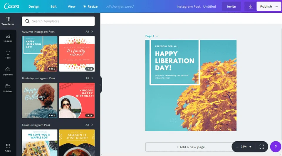
This is at the top due to the user-friendly nature of Canva. Sign in to your Canva account, click “create a design”, then scroll through them until you find “infographics”. Choose to start with a blank image or choose one of the templates. You can also “explore templates” to find more from the Canva Marketplace. Change the information to suit your needs, and you’re done.
Easel.ly
This simple-to-use platform enables you to create infographics using their templates, or by starting fresh with your own. What you can do with this without upgrading to the pro version is limited, but the pro version isn’t very expensive. There is a small learning curve to understand their set-up, but once you do, you can create infographics in minutes.
Infogr.am
Start with a free account to create an infographic. You can choose from their library or start fresh. Choose a template with different color schemes and types of data. Then simply edit them to add your own data and titles. You can even add video, interactive maps, and more.
Piktochart
This platform is super-easy to use and very intuitive. But don’t be fooled by the ease of use; it can create very dynamic infographics that work across platforms fast and easily. They also have amazing tutorials to help you along the way. The Pro account will pay off if you plan to create a lot of infographics and other types of graphics and images on a regular basis.
Venngage
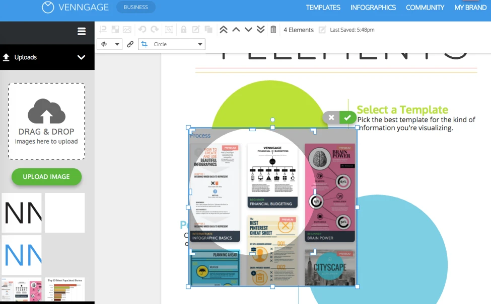
This cloud-based program can be used free if you’re a student, and then from $19 to $48 a month depending on how much you plan to use it and what you want to use it for (as each account is limited based on the type). The only tricky part of this software is learning their terms and how to line things up properly; but once you learn it, you’ll be creating infographics (and other types of graphics) like a pro.
Visme.co
This very flexible browser-based creator is easy to use and understand, even if you’re not a graphic designer. It starts out as free, but you will have to pay for premium images, layouts, and templates. However, it’s more than worth the small price to be able to make infographics yourself.
Adobe Illustrator
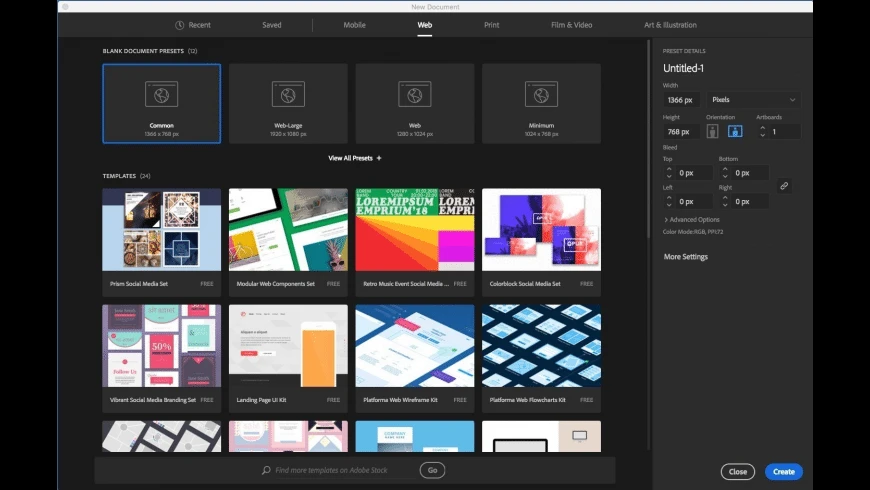
Today, with the advent of monthly membership via the creative cloud to use Adobe graphics products, there is no reason the average person can’t learn to create infographics using this professional software by watching tutorials.
Gimp.org
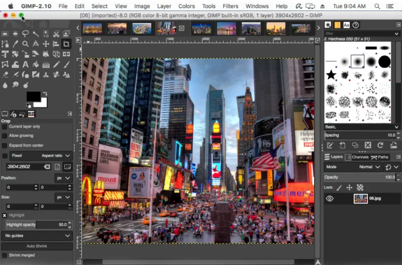
This is free software that you can download and used to create any type of graphic, including infographics, if you’re talented in graphic design. Like most software today, there are tutorials available on YouTube put up by people who are using it, so you can learn more from them. And you can’t beat completely free and not needing an internet connection while you create.
These are just a few of the tools available today. Do a quick Google search for software to create infographics, and you’ll come back with many pages of information to look through. The tools above are our favorites.
Some of them work for people whether they have graphic design abilities or not. If you understand your data and how you want to tell the story of that data, you too can produce infographics easily.
Mistakes to Avoid When Designing an Infographic
For an infographic to be effective, it has to be well-made. Here are some mistakes to avoid when designing your next infographic.
Not Checking Your Math
If the numbers don’t add up, they’ll be even more noticeable when you use images. Ensure that the way you arrange everything means that the numbers add up. There’s nothing like people focusing on your numbers being 147 percent instead of 100 percent. Even if there are reasons, the information will not be believable if the numbers don’t make sense.
Not Using the Right Form of Chart or Graph
There are many types of charts, from 3D graphics, to pie charts, to stacked bars, line charts, and more. Use the right type to show the information you want correctly, without trying to trick the reader into thinking something is better than it is by the visuals you use.
Not Laser Targeting the Information
When you are trying to create an infographic, you need to narrow down the type of information that you want to provide. It’s imperative that you don’t try to convey too much information in one infographic. You may be able to create more than one infographic out of any survey or group of data that you obtain.
Not Scaling Images Correctly
When you are using images to portray a value, it’s imperative that the images you choose are proportional in relation to the number. Don’t try to make numbers look bigger than they are by your visuals.
Not Creating Compelling Headlines
If you want someone to click through to look at your infographic and to keep reading it, take the time to develop headlines that make people want to know more.
Not Including the Legend on the Infographic
Some people try to save space by putting a link to the legend, but you don’t want to do it that way. Put the legend in a clear place right on the infographic.
Not Using the Right Comparisons
Don’t compare apples and oranges. Ensure that any comparisons you make aren’t conflating two different things. If you do that, you’ll confuse your audience – plus, you might even turn them off.
Not Using Logic When Arranging Data
Arranging data logically is important. For example, if you want to demonstrate something using a pie chart, put the colors of the pie in the order of size.
Using infographics can help explain tough-to-understand data, directions, and information that you have explained in an article, blog post, or white paper. The addition of an infographic that can work both with and without the text information will help you impart information in a better way; you just need to know the mistakes to avoid when designing an infographic.


